We make ideas tangible.
See our Design gallery +Design lives in every touchpoint—the menu in a guest’s hand, the coaster under their drink, your to-go packaging. Each piece should carry your story with the same care as your food. We create designs that feel intentional and true to your concept. The goal isn’t just to make something beautiful; it’s to make something that works—design that builds recognition, stirs appetite, and deepens loyalty. From menus to merch, every detail works together to extend your brand beyond the table and keep guests connected long after the check is signed.
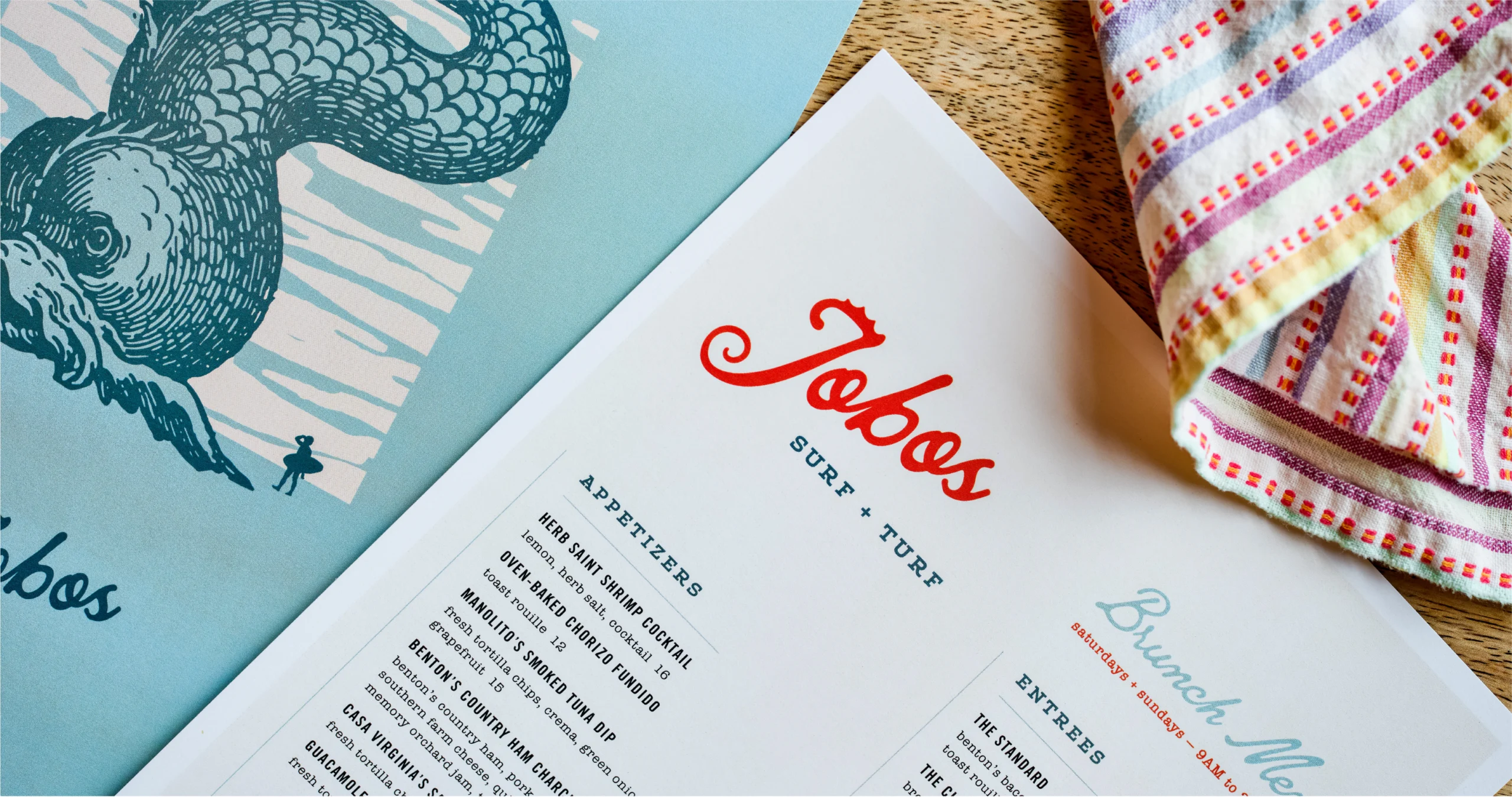
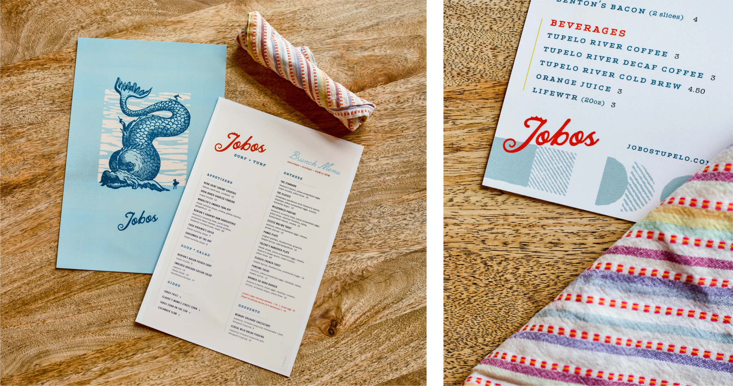
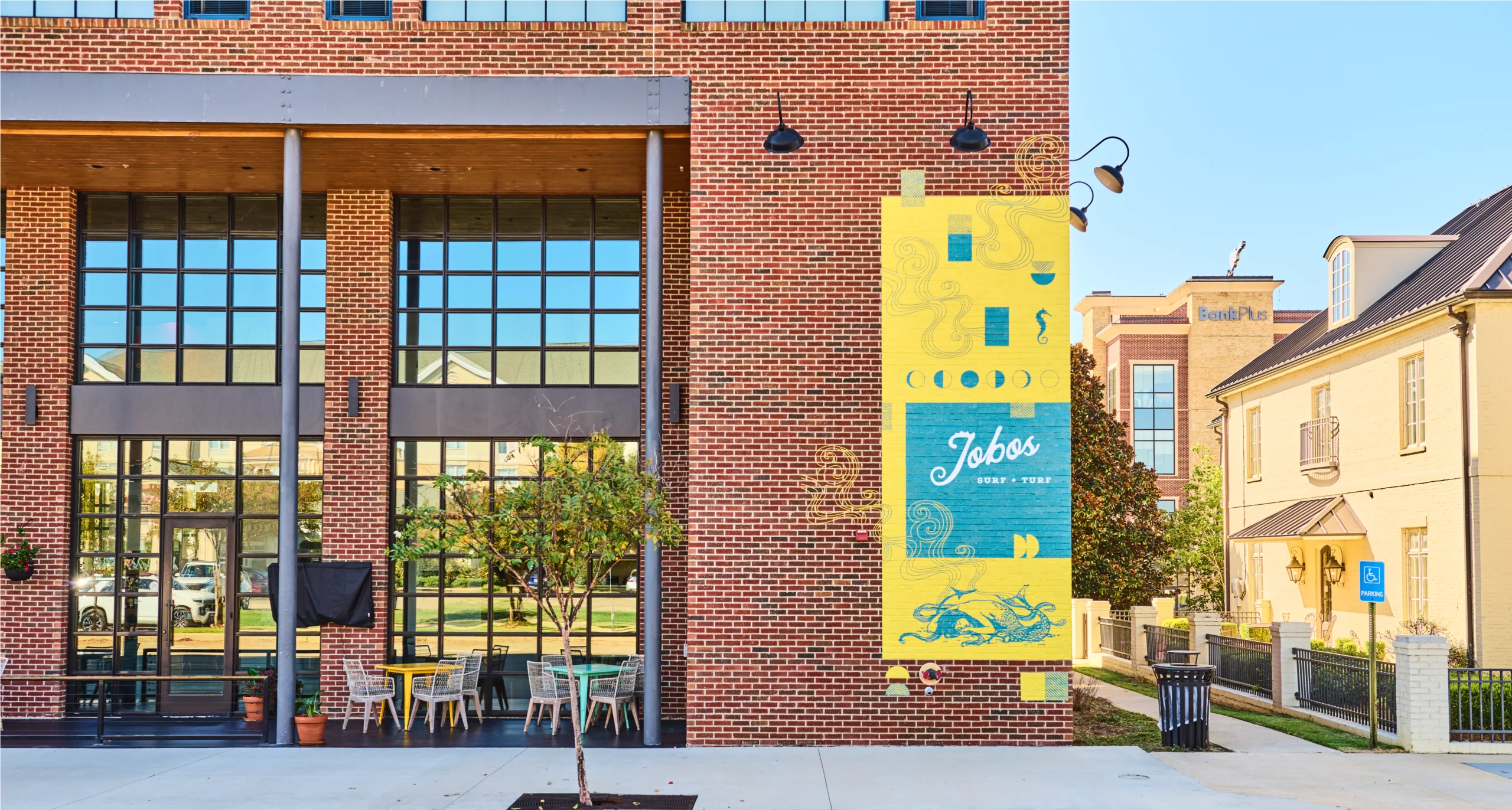
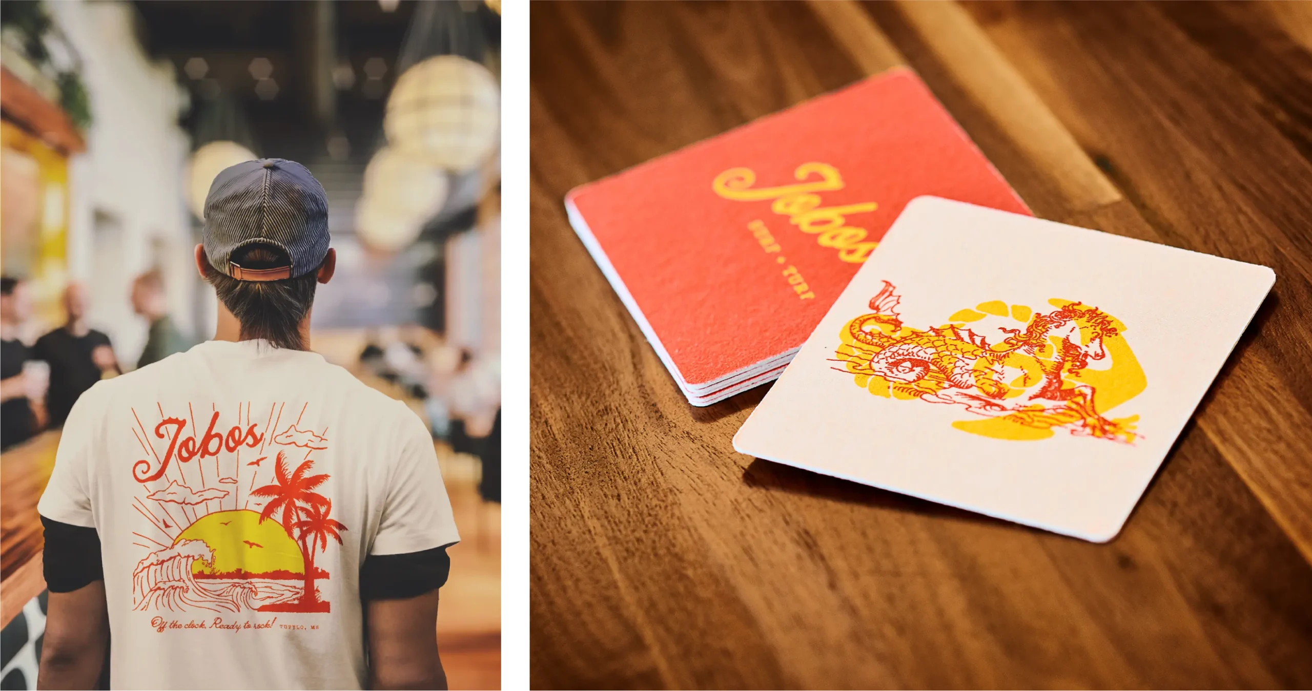
Jobos
Jobos required work that could move quickly without losing its polish. Menus and printed materials were built to handle high-volume service while still carrying a sense of ease. Layouts favor legibility and rhythm over decoration, giving the food room to speak and providing staff tools that feel intuitive during a busy shift.
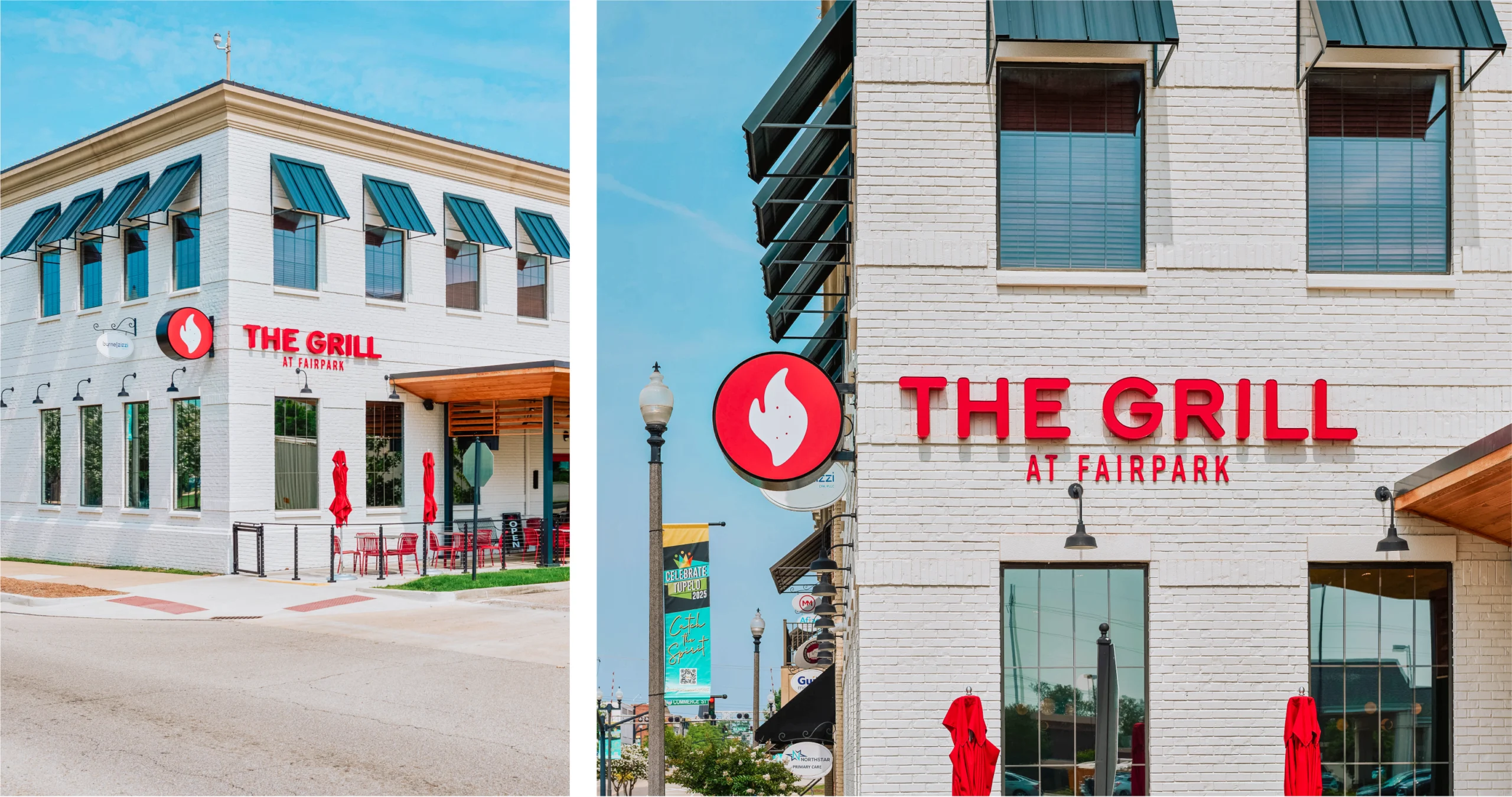
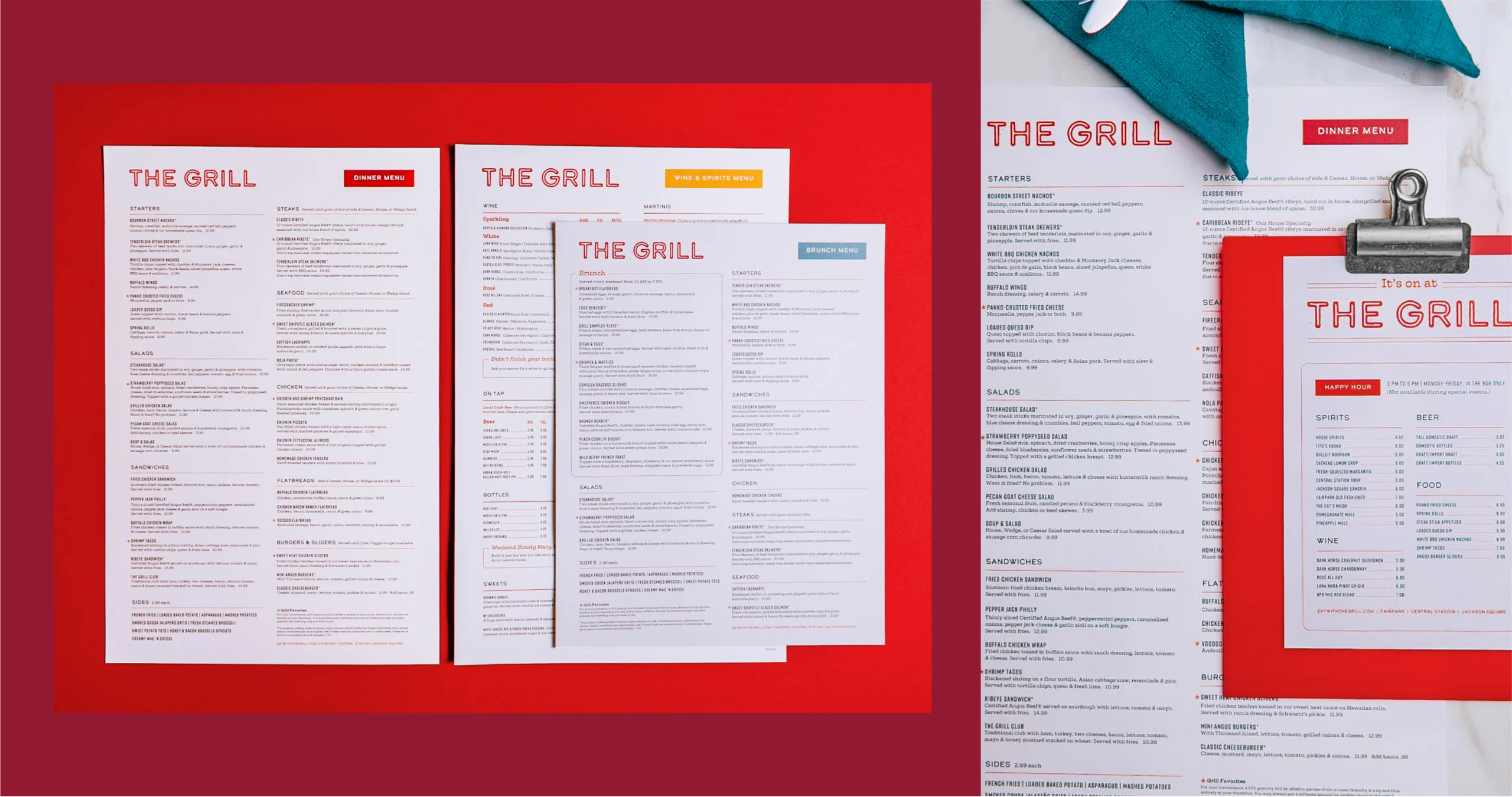
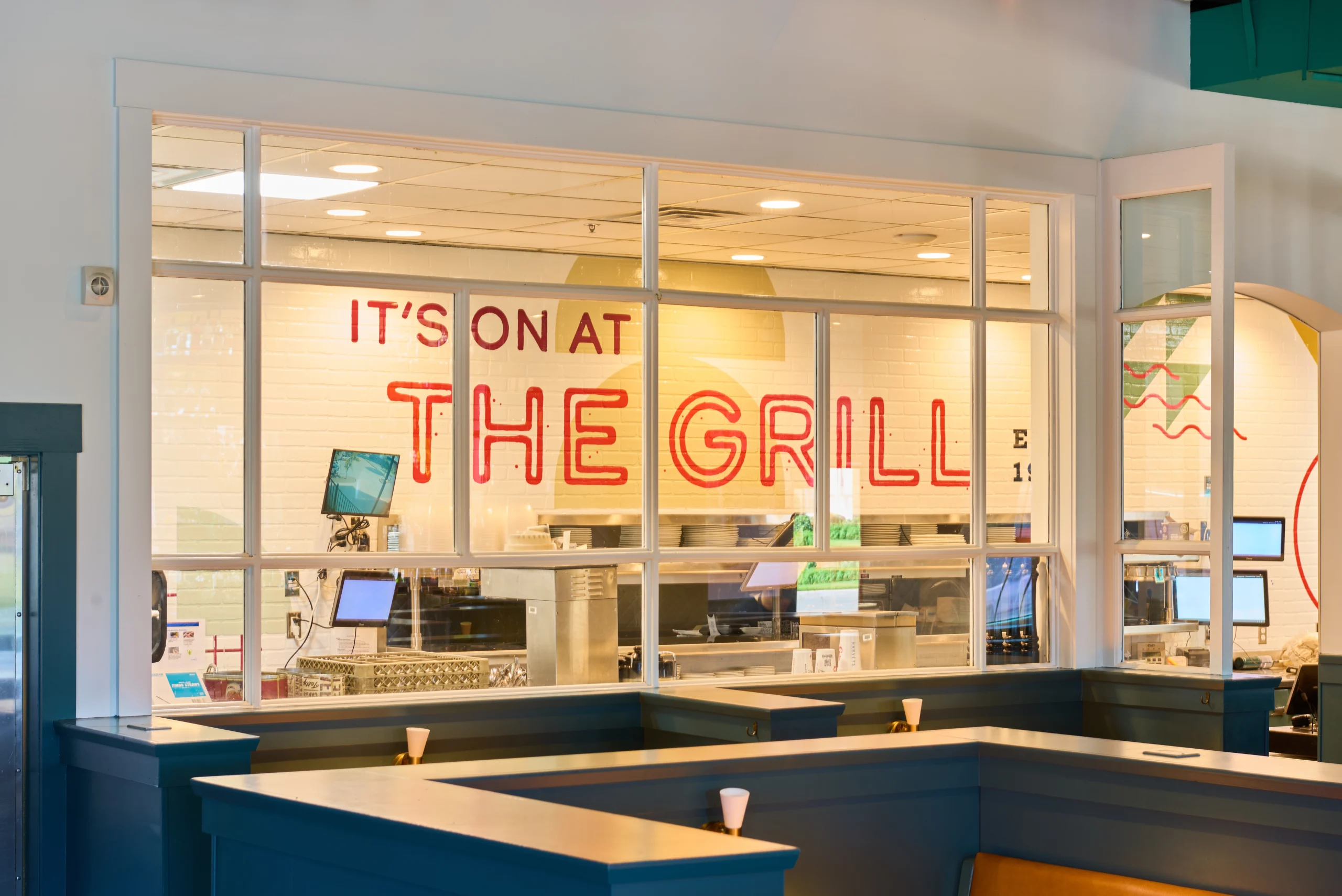
The Grill
The Grill focused on making everyday materials feel personal. Menus and printed pieces were developed alongside custom art and signage, allowing each location to feel lived-in while staying connected. The system leaves room for personality, letting the restaurant evolve naturally without losing its sense of place.
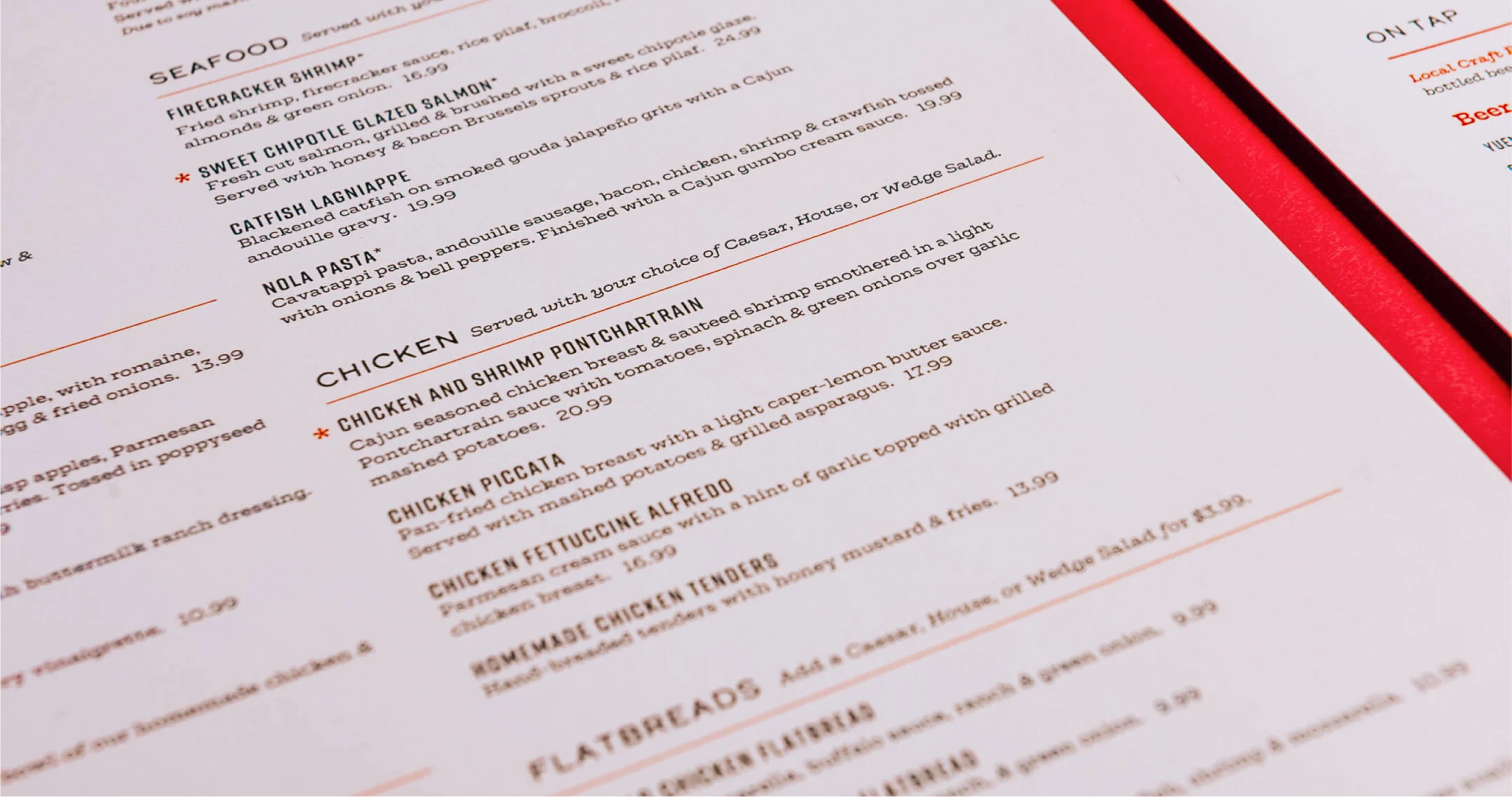
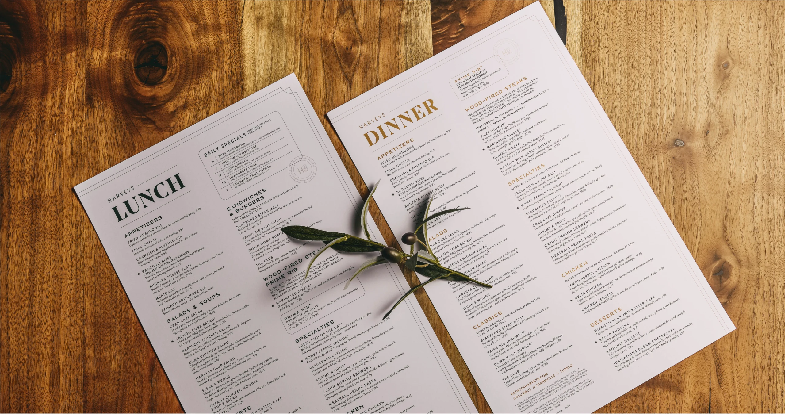
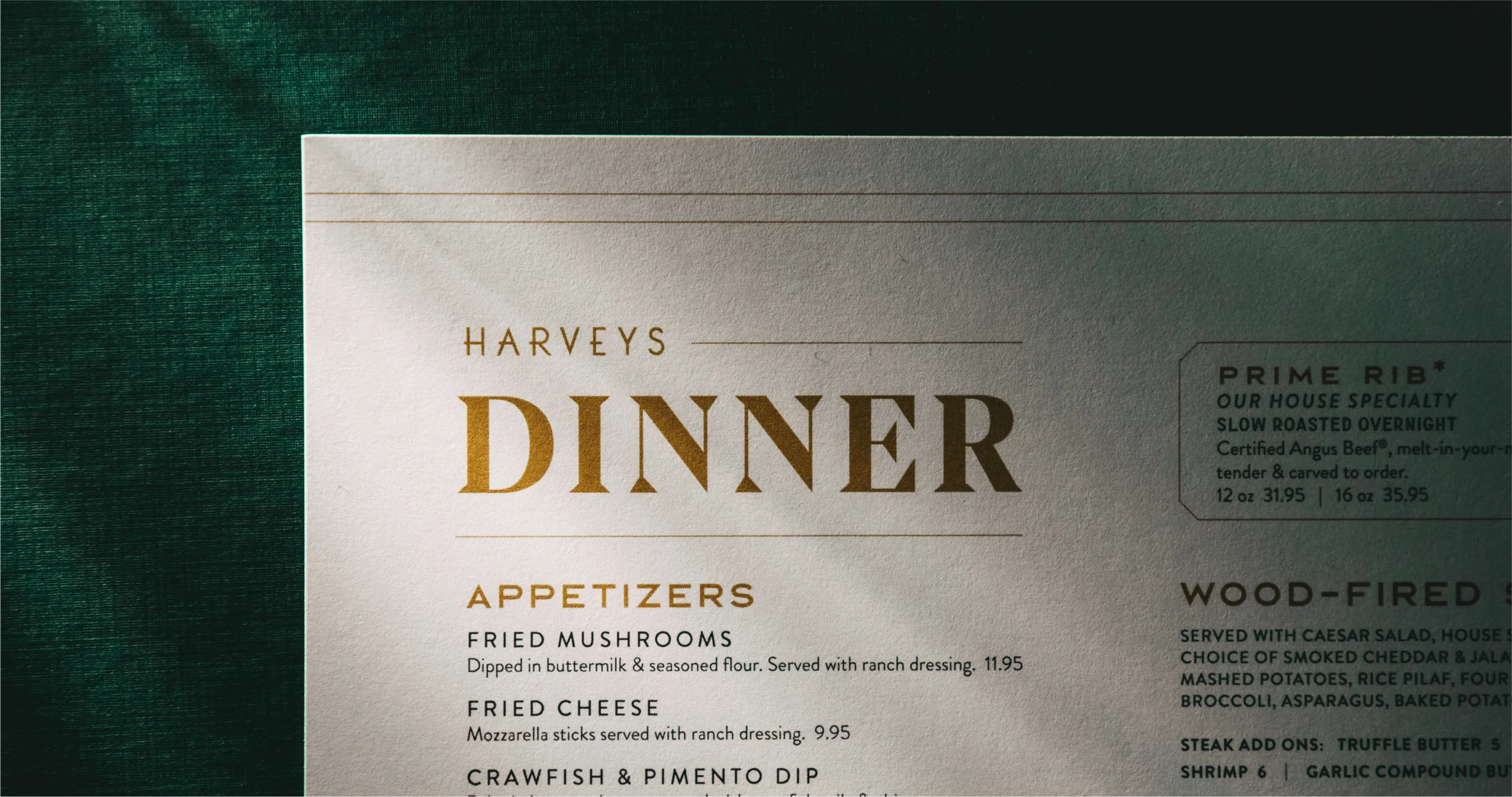
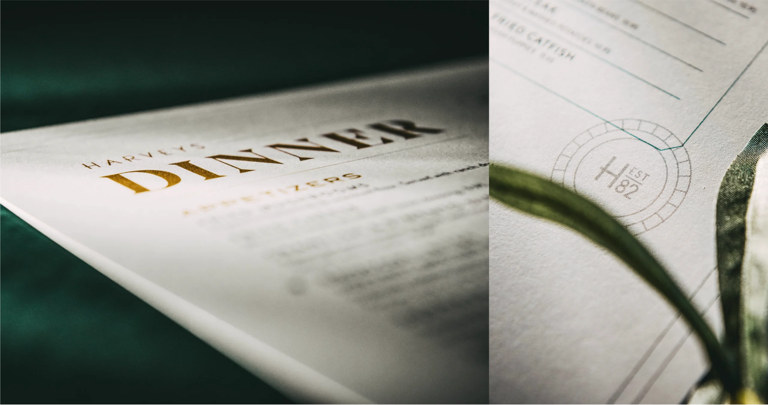
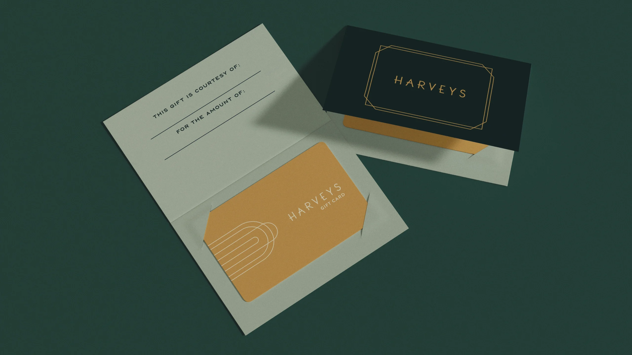
Harveys
Harveys centered on cleaning up without wiping the slate. Menus, signage, and supporting materials were reorganized and clarified, improving consistency across locations. The work respects familiarity, making the experience easier to navigate while keeping the restaurant recognizable to guests who have been coming for decades.
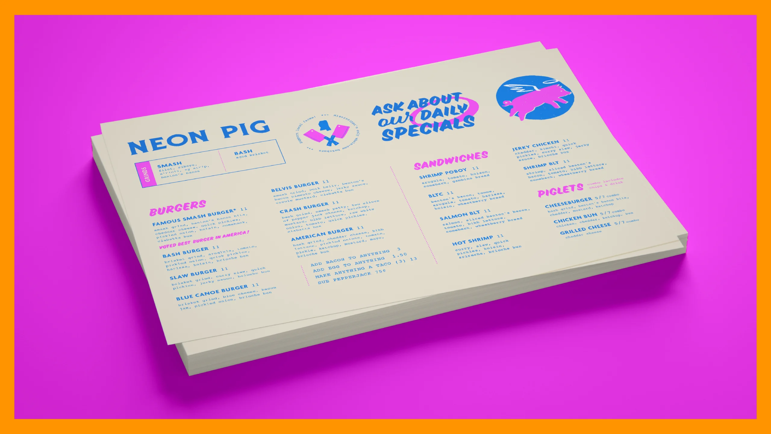
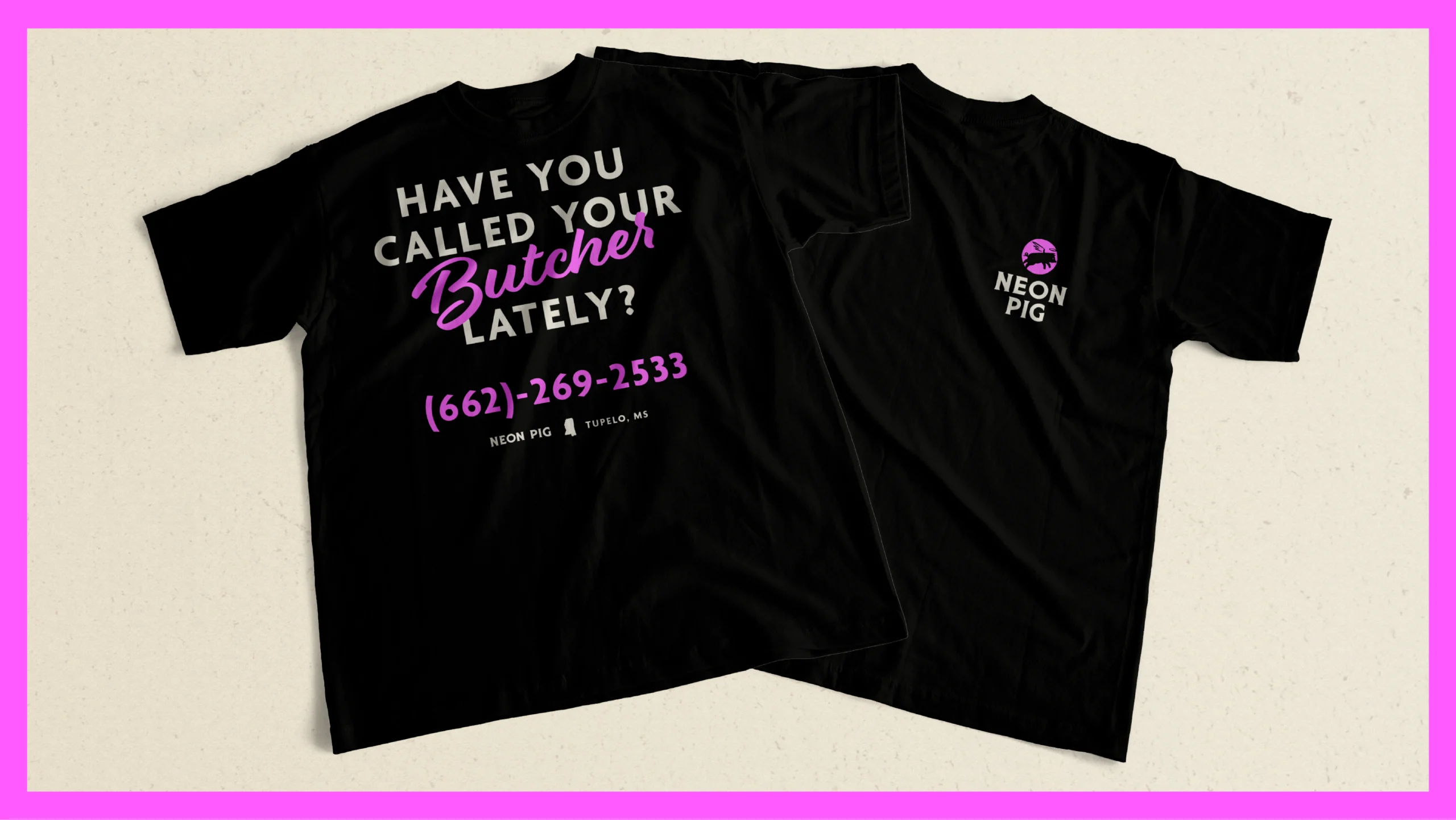
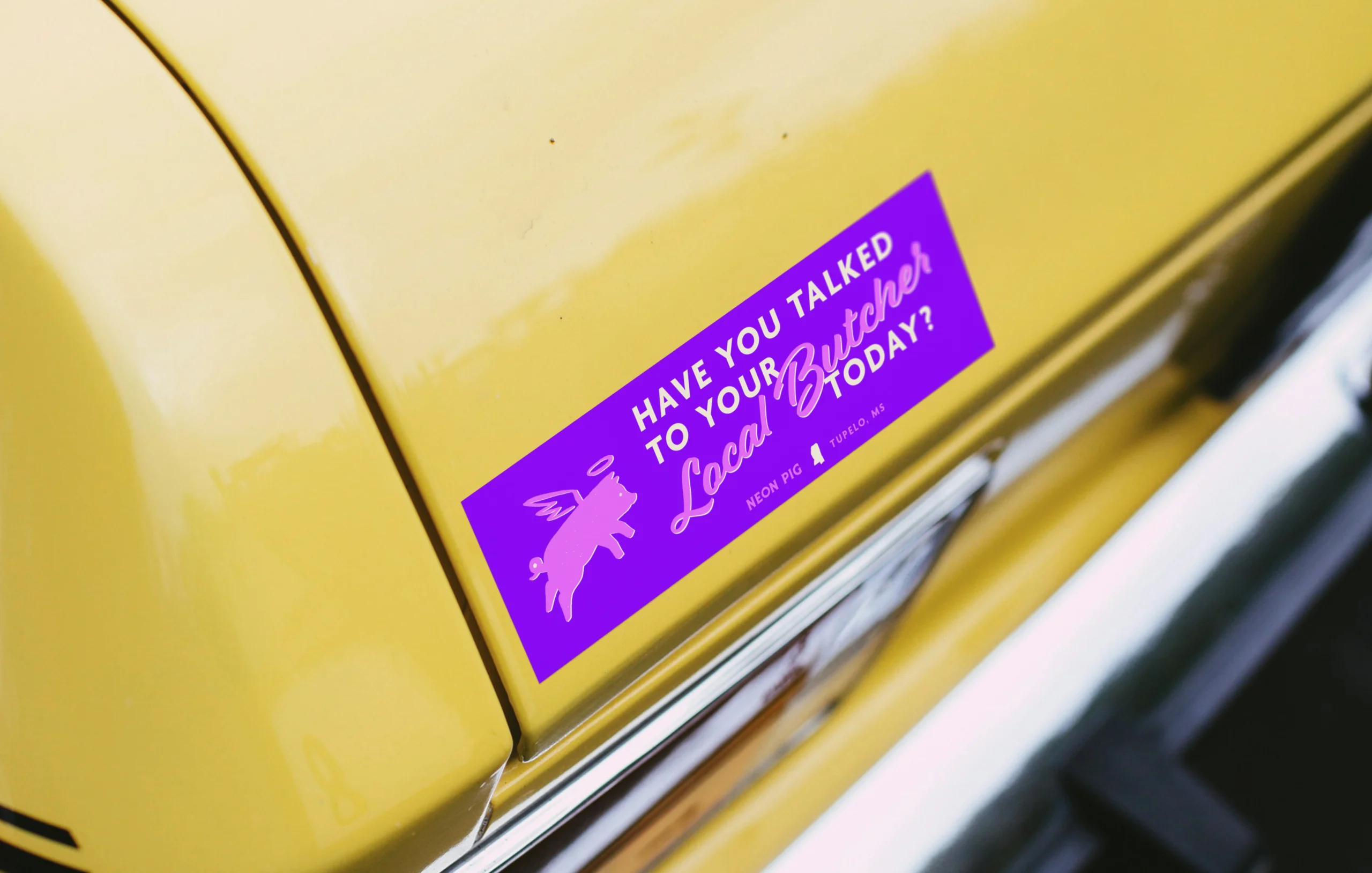
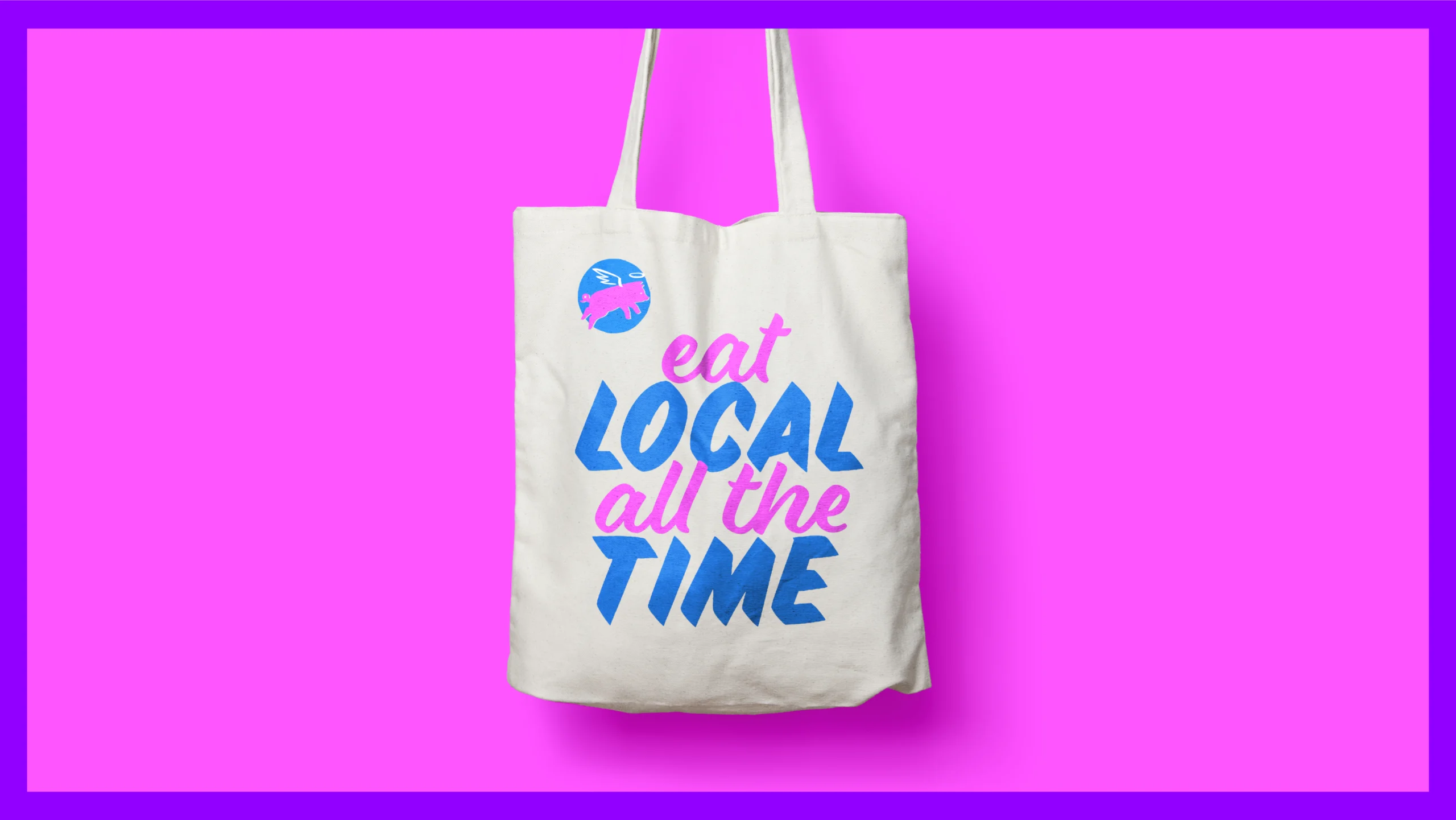
Neon Pig
Neon Pig thrives on friction. Menus, signage, and collateral pull from rough edges, loud color, and hand-made references, creating an energy that feels raw and unapologetic. Each piece reinforces the chaos and confidence of a place that never aimed to be tidy or overly refined.
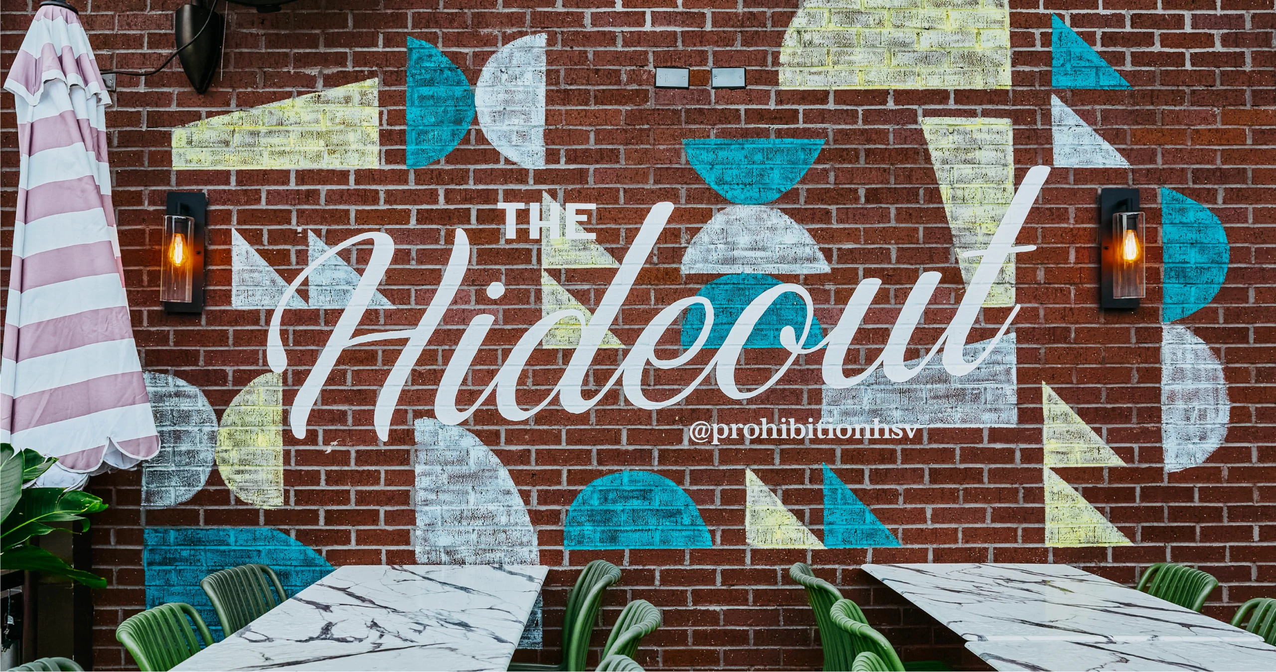
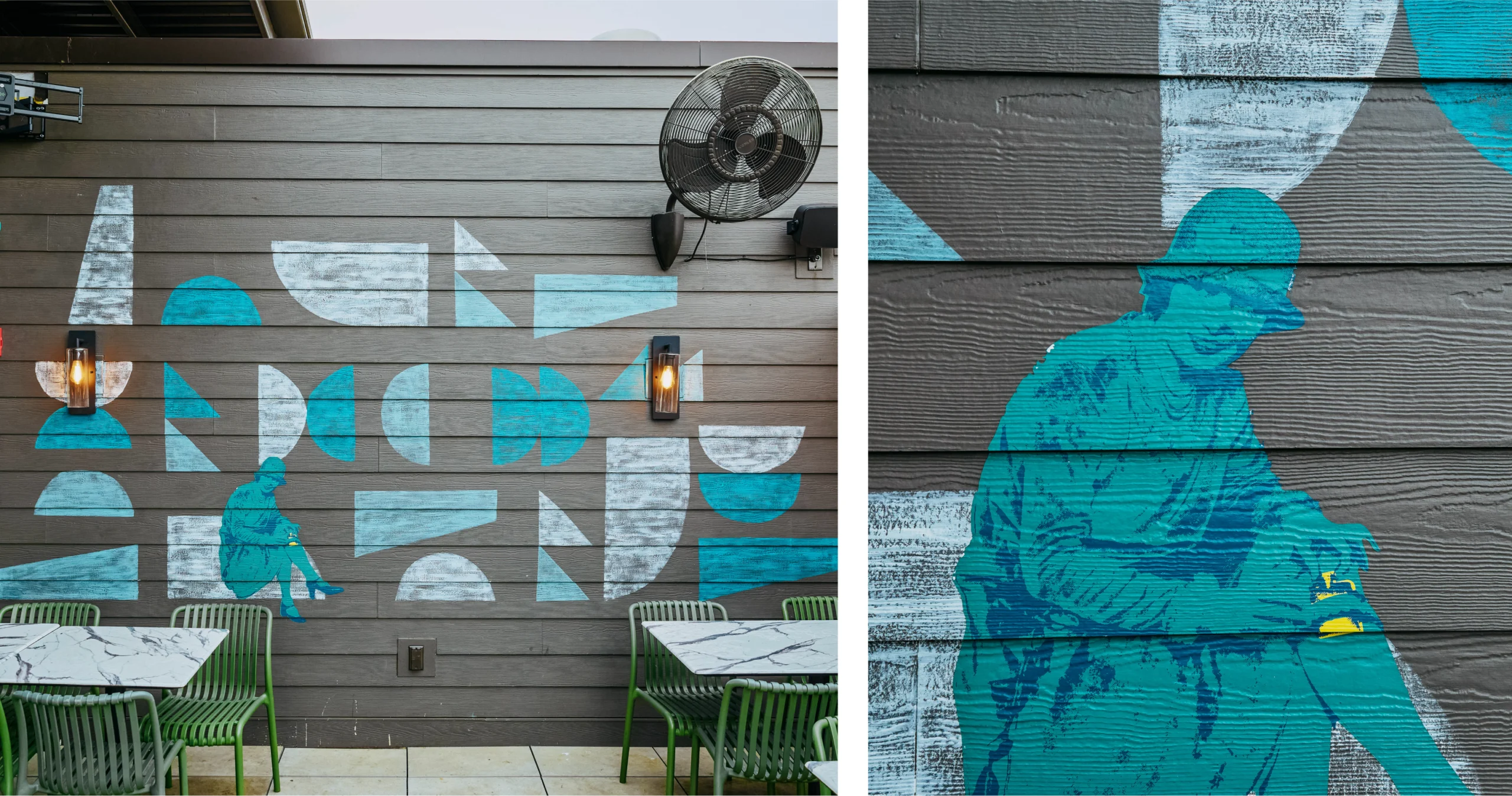
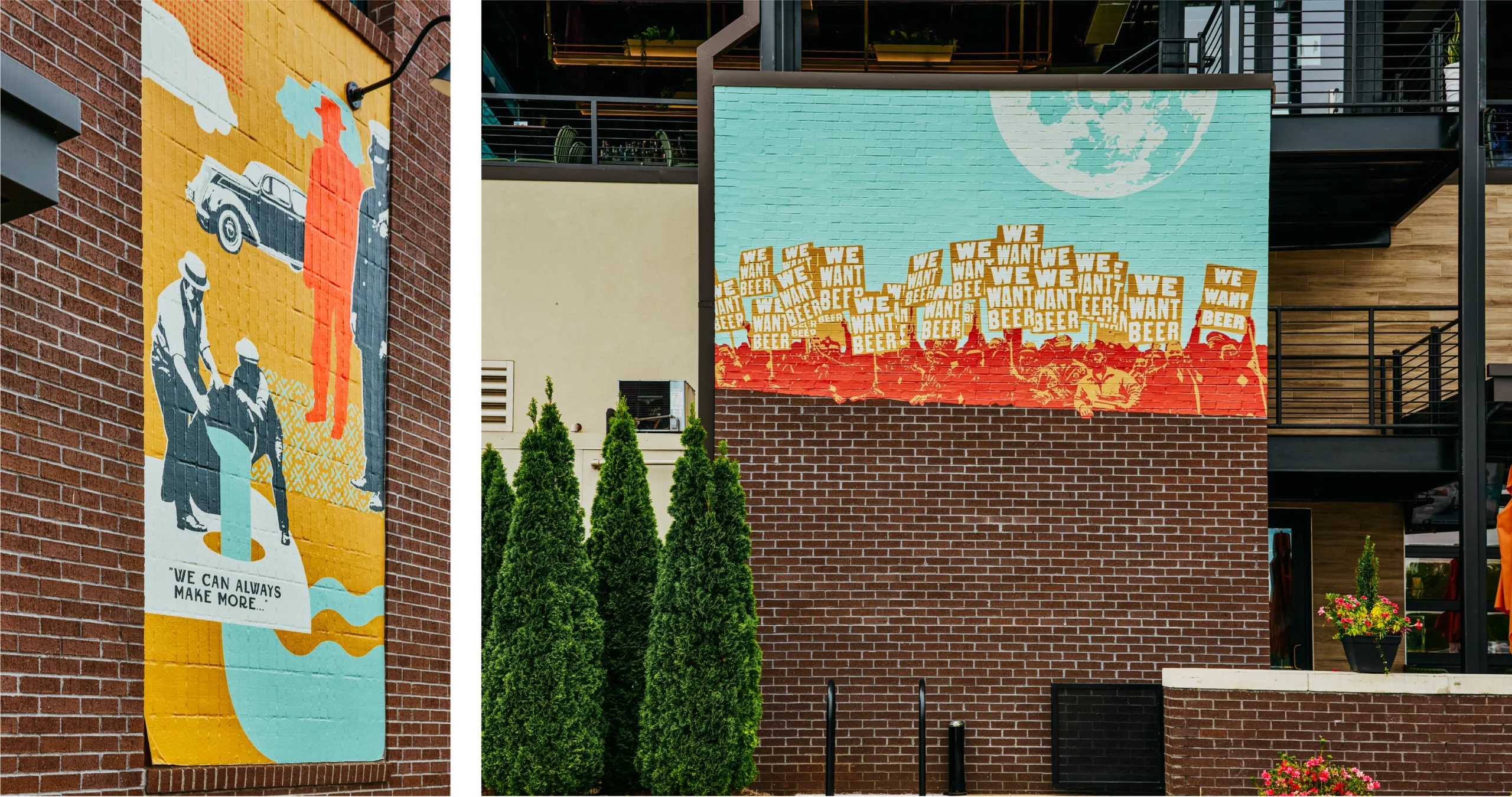
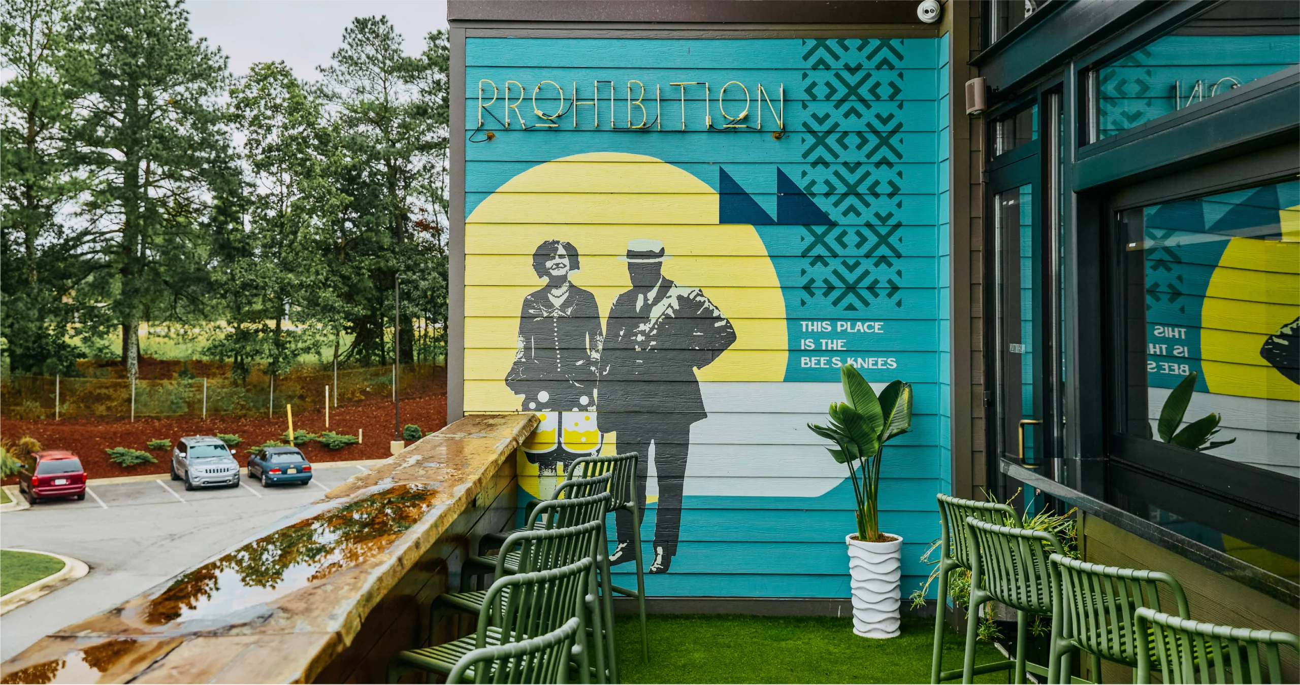
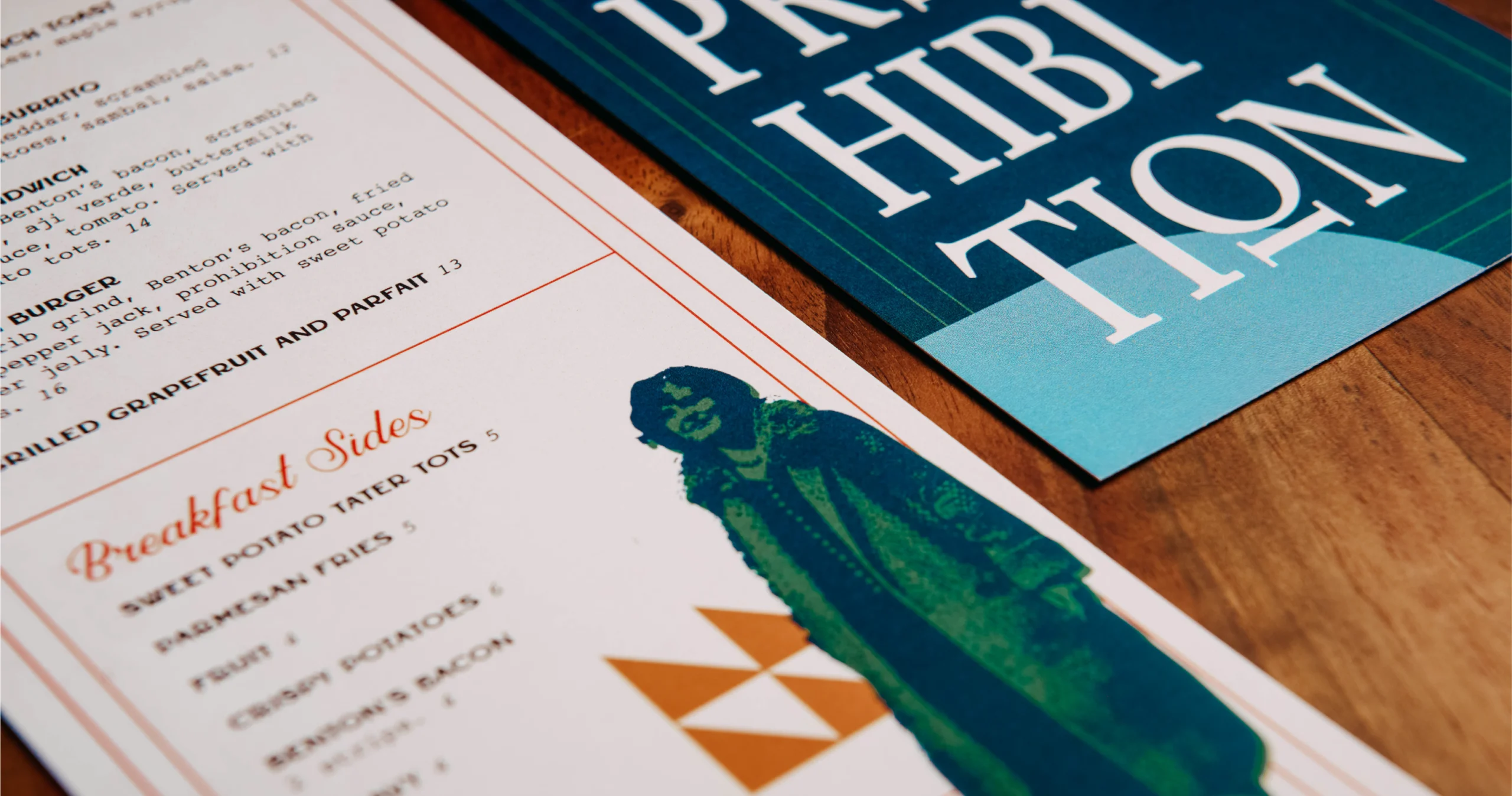
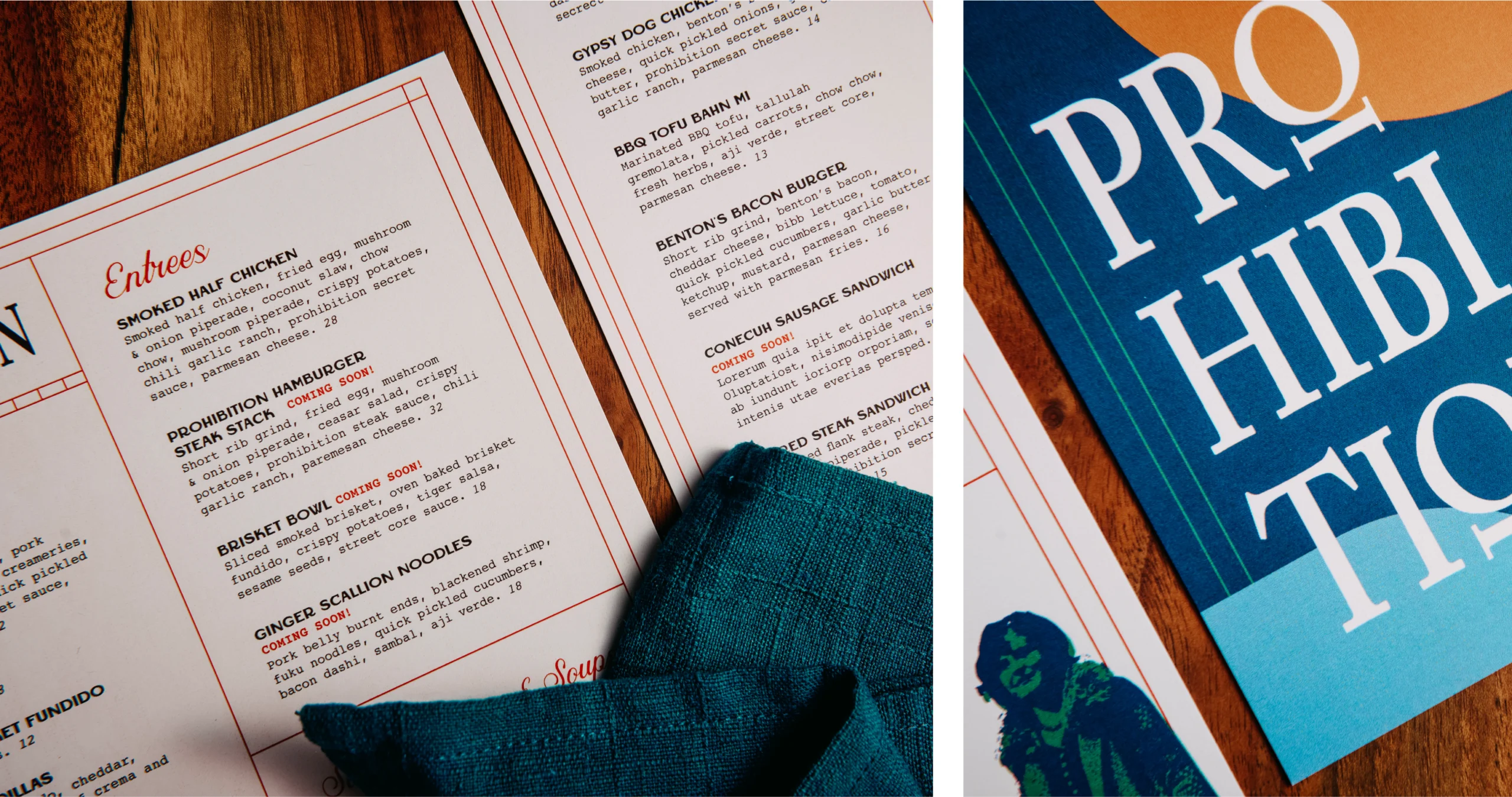
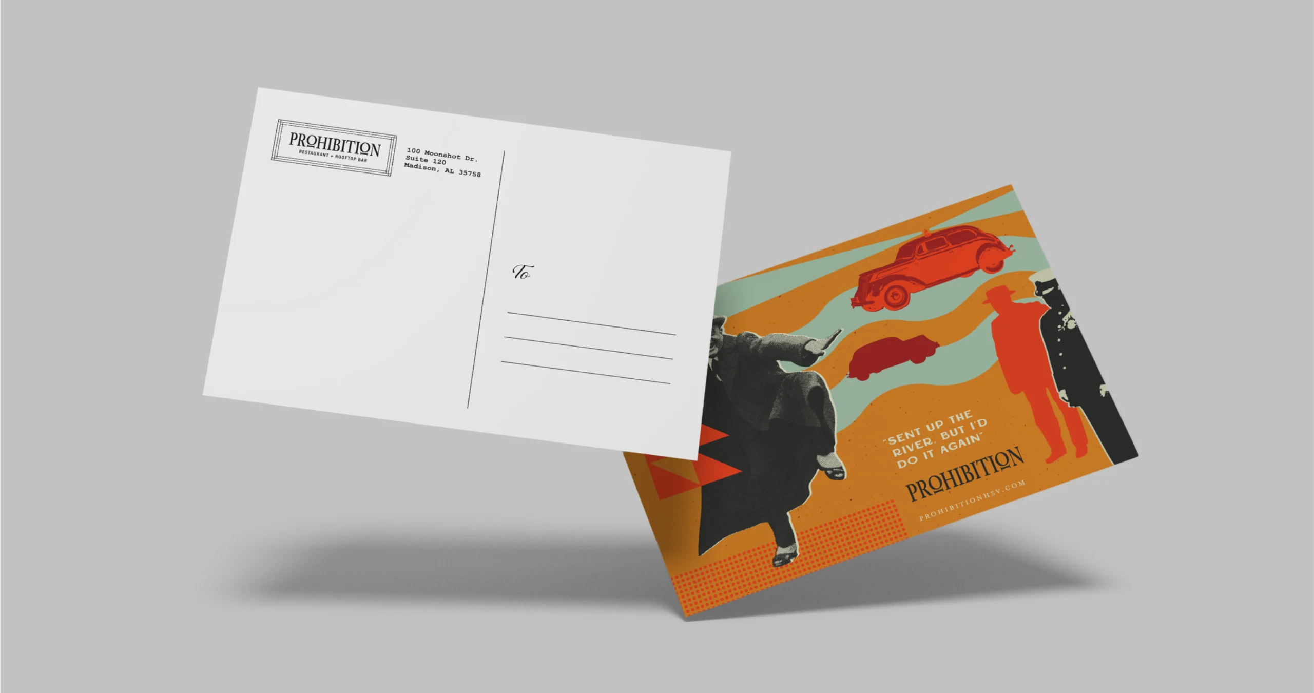
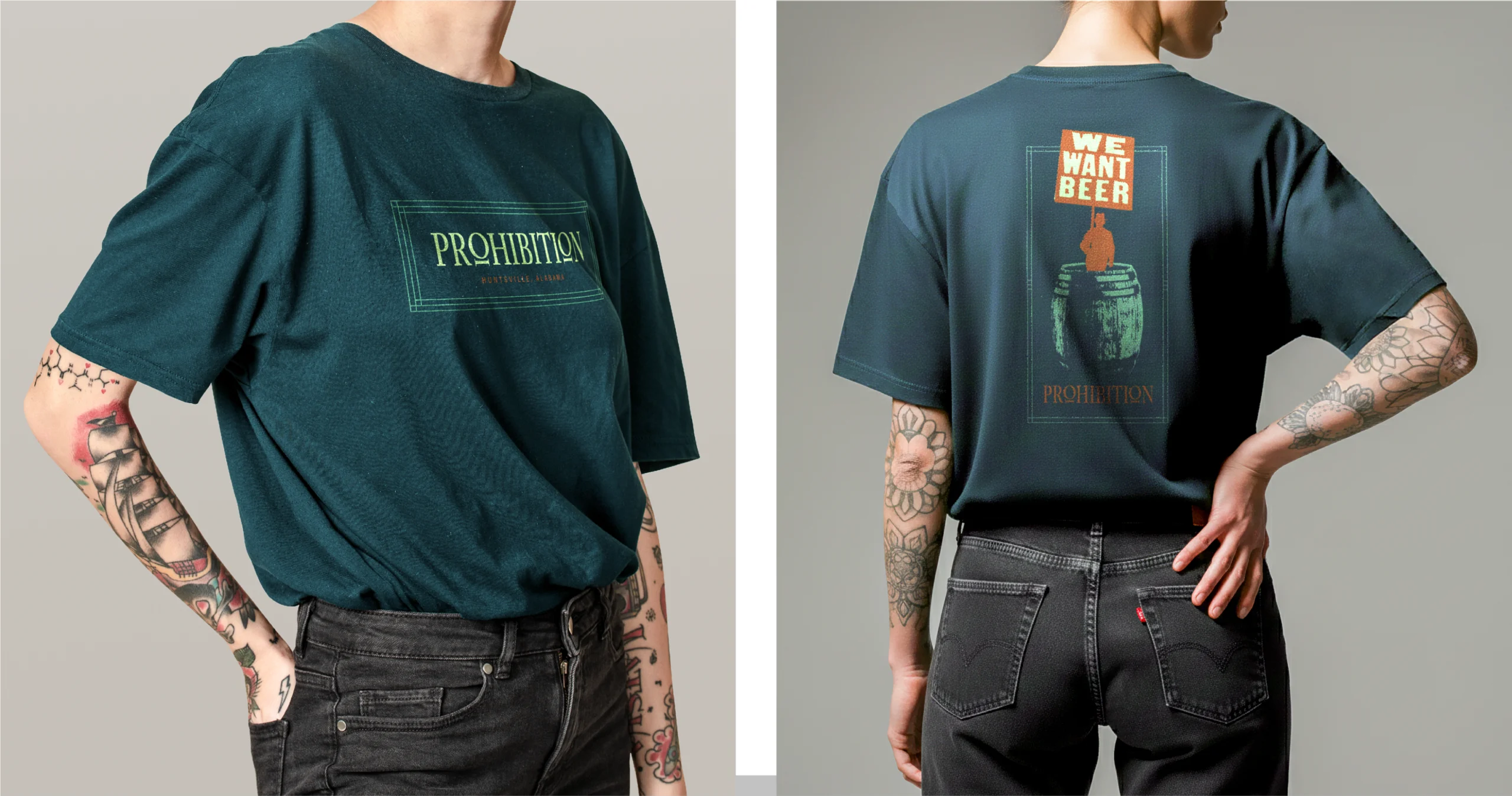
Prohibition
Prohibition was about controlling mood. Menus, collateral, and in-house pieces were treated as part of the room rather than standalone objects. Typography, scale, and texture shift with the space, reinforcing a layered experience that unfolds as guests move through the building rather than announcing itself all at once.
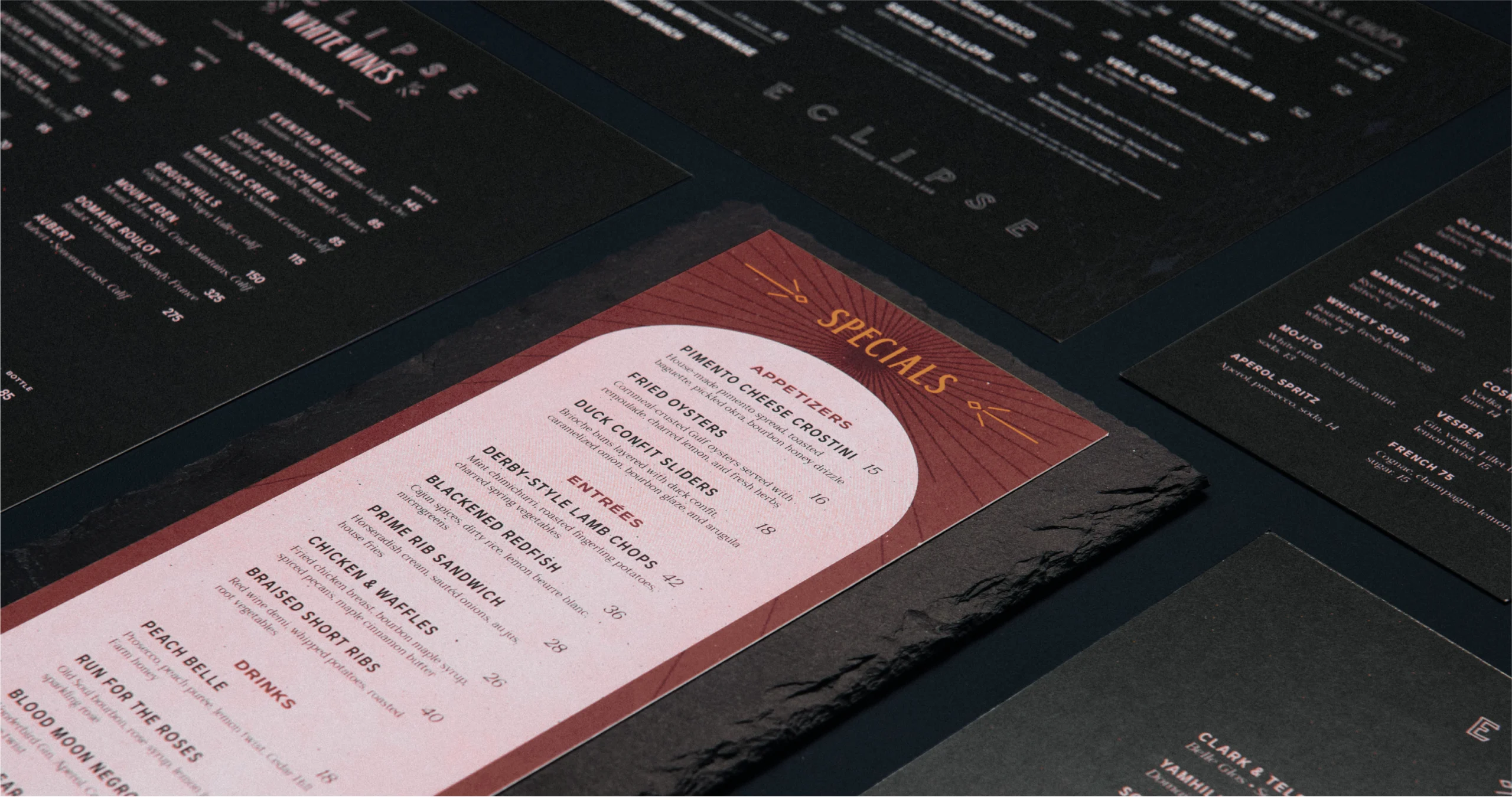
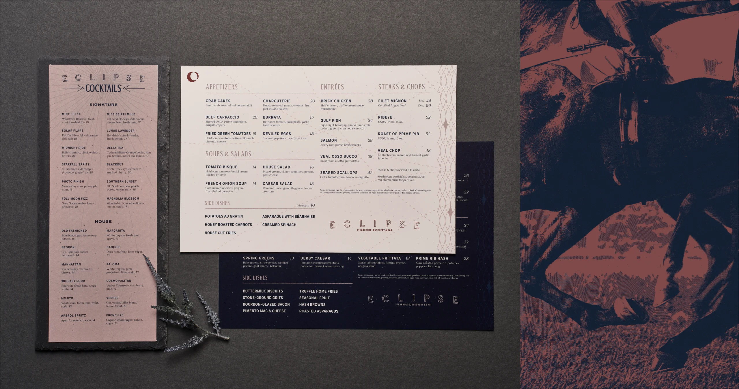
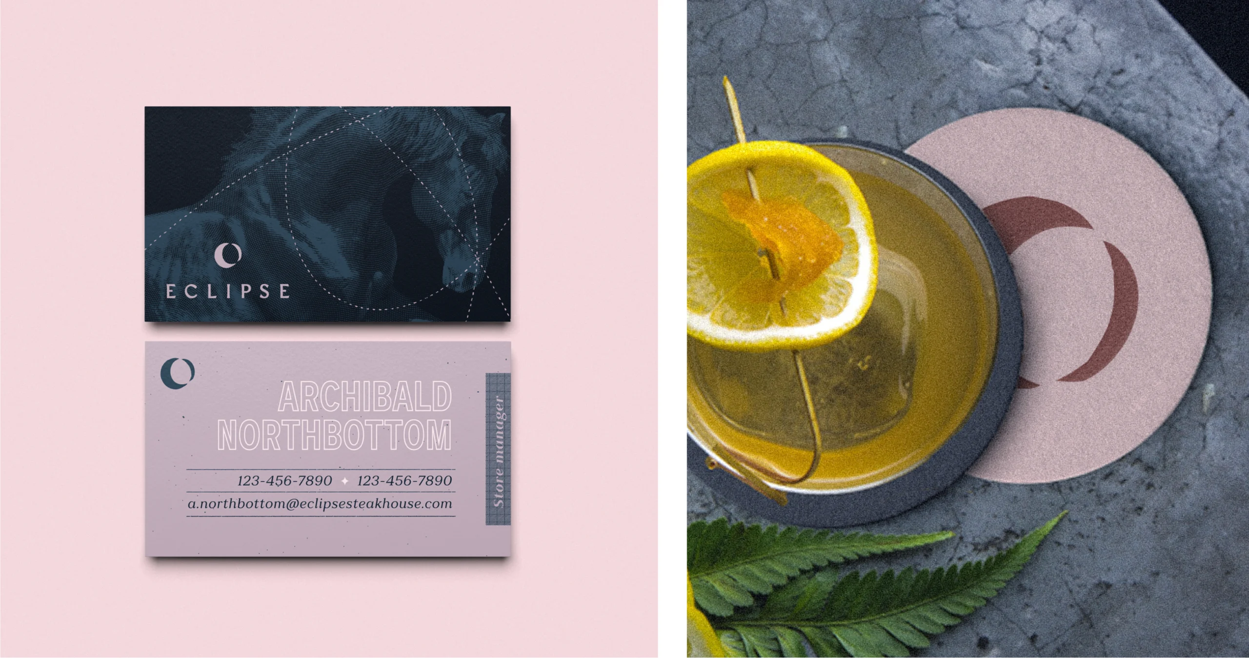
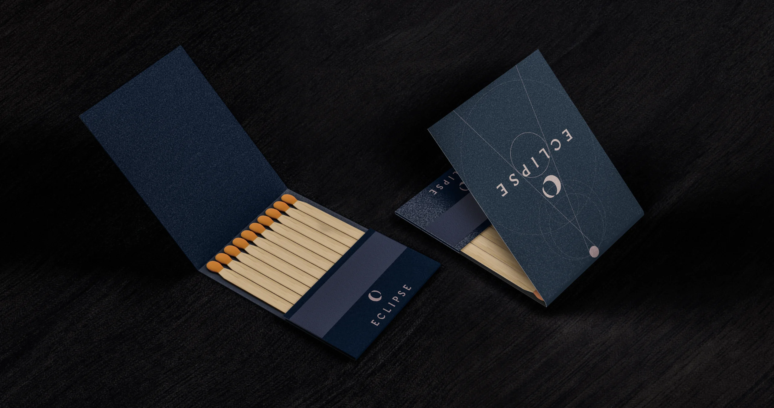
Eclipse
Eclipse stays out of the way. Menus and printed materials rely on spacing, proportion, and restraint, creating a quiet backdrop for hand-cut steaks and careful sourcing. The work avoids flourish, using subtlety to reinforce a dining experience built on focus, confidence, and intention.

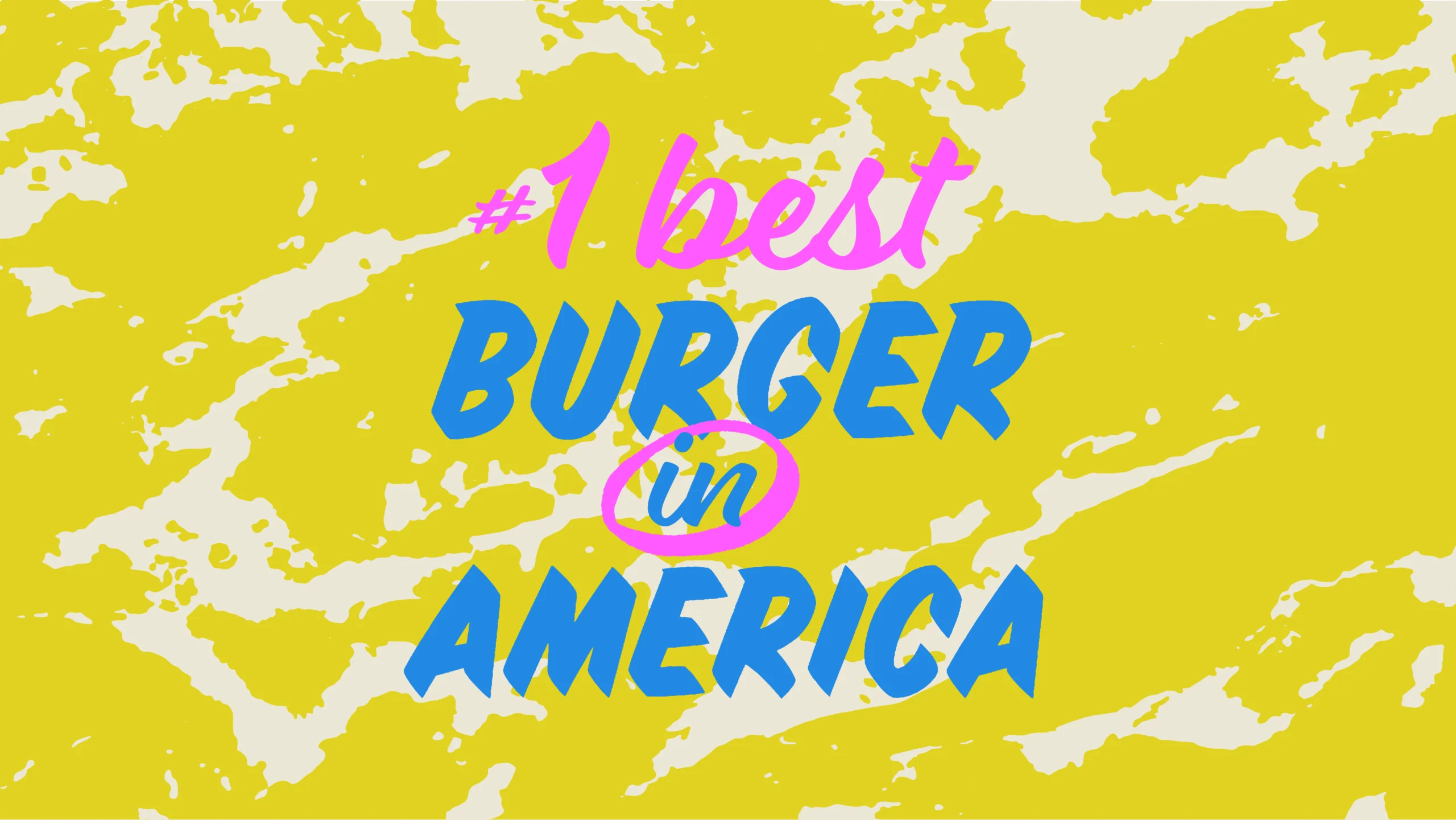
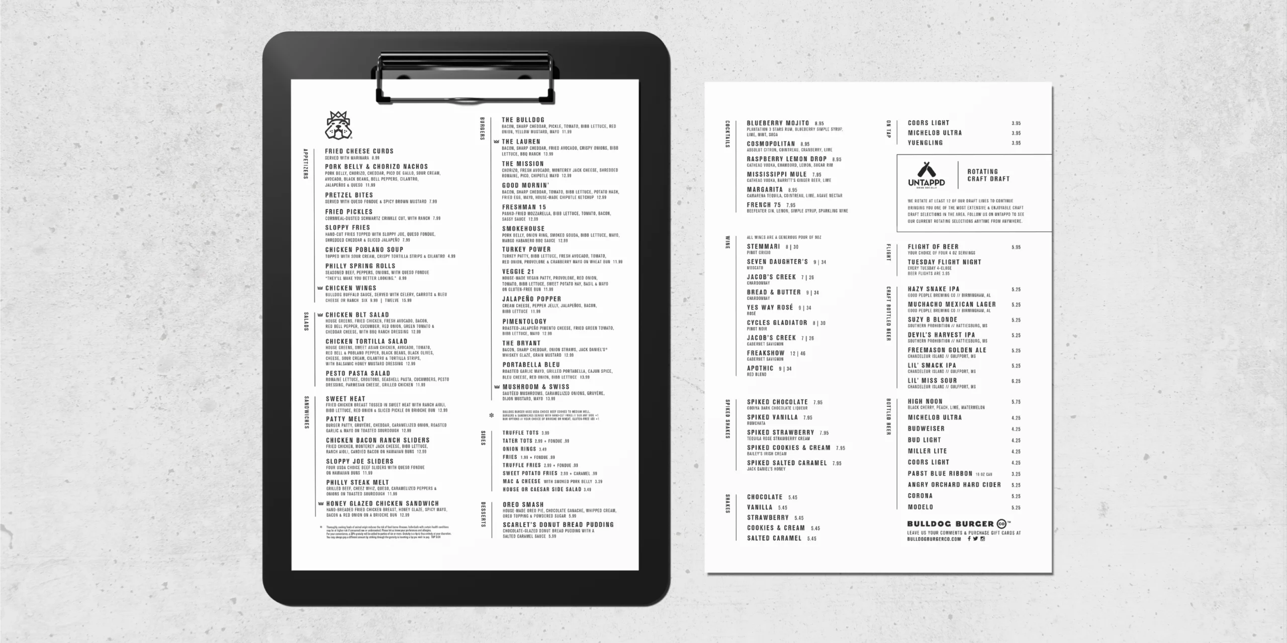
Bulldog Burger Co.
Bulldog Burger Co.’s design system keeps everything direct and functional. Clean icons and straightforward typography set the foundation, giving the brand a visual language that feels purposeful and unfussy. We carried that system across menus, wall graphics, and the butcher paper liners used on steel serving trays. Each piece reinforces clarity and appetite, turning everyday touchpoints into part of a cohesive, working system.
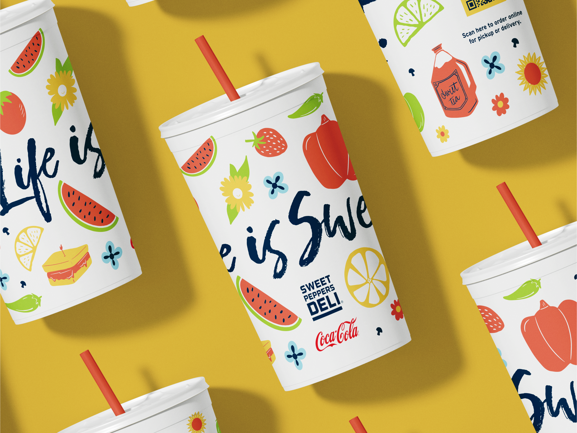
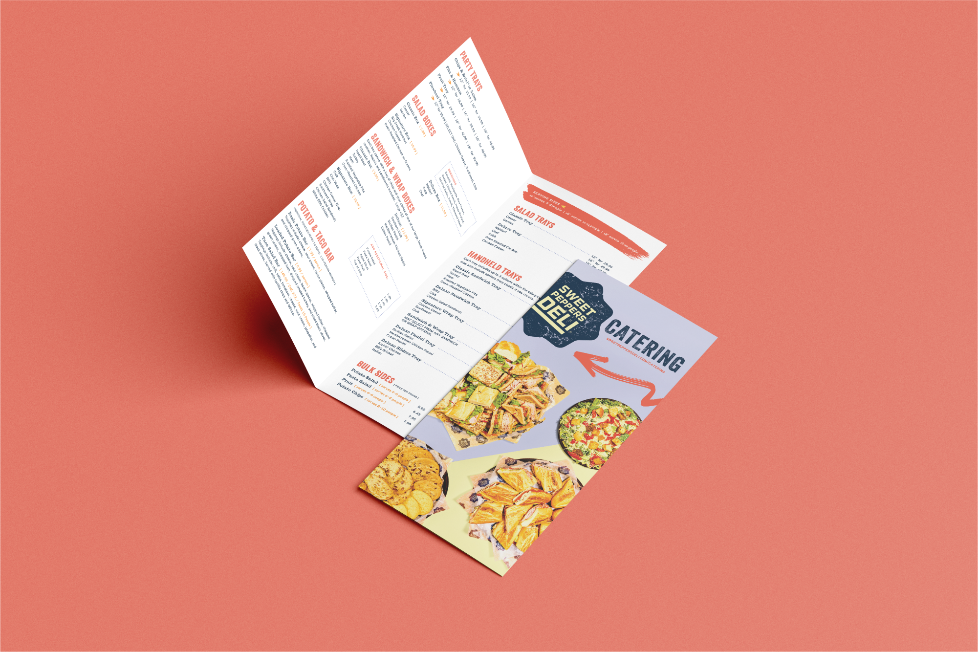
Sweet Peppers Deli
Sweet Peppers Deli’s design work focused on the details guests interact with most. Some items include cups, menus, catering boxes, digital menu boards, and supporting materials built to feel consistent, upbeat, and easy to recognize. Color and pattern bring energy to utilitarian touchpoints, helping the brand show up clearly across dine-in, takeout, and catering while staying practical, repeatable, and ready to scale.